Extrafemi studio · Case study
From Cluttered to Command-Ready: Redesigning the Interface of an Underwater Robot
When we joined a project at Caretta Robotics in North Cyprus, we weren’t just working on a UI redesign. We were crafting an interface that could make the difference between success and failure.
- Client
- Caretta Robotics (opens in a new tab), North Cyprus
- Studio
- Extrafemi
- Scope
- UI and UX redesign of the control software for an underwater robot
- Tools
- Figma
- Status
- Entering the testing phase
Before and after
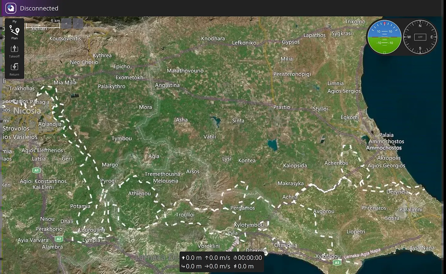
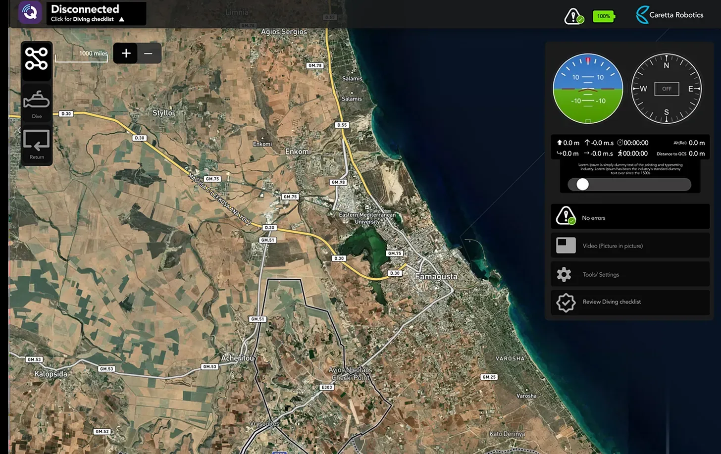
01 · The project
Deep beneath the ocean
We weren’t just working on a UI redesign when we joined a project at Caretta Robotics (opens in a new tab) in North Cyprus. We were crafting an interface that could make the difference between success and failure, deep beneath the ocean.
As UI/UX designers, we had the opportunity to work on the control software for an underwater robot built to carry out complex marine missions. The system enables operators to navigate, plan, and monitor robot activity in real time over satellite imagery. But when we first encountered the software, it was clear that while the functionality existed, the interface was holding it back.
02 · A global team
A truly global collaboration
This wasn’t just a local project. The team consisted of diverse minds across continents: an Iranian systems engineer, a Turkish-Cypriot communications director, and a Nigerian designer with a passion for intuitive, purpose-driven user interfaces.
Each of us brought a different approach to problem-solving, whether it was in optimizing the user flow, addressing unique constraints, or balancing technical feasibility with user experience. That diversity didn’t just make the team stronger, it made the product better. We constantly questioned assumptions, challenged conventions, and learned to build with empathy for users across borders.
03 · The challenge
The challenge
The original UI was overloaded. Multiple panels overlapped. Alerts weren’t visually prioritised. Control logic was buried inside technical menus. For a robot intended for real-time underwater operations, where conditions can change quickly and reliability is non-negotiable, this wasn’t just a design flaw, it was a risk.
The original interface was a liability in high-pressure underwater environments, where seconds count. It made critical operations unnecessarily complex and error-prone.
We knew the redesign had to do three key things:
- Clarify the interface for better usability in high-pressure scenarios.
- Highlight system feedback, particularly for disconnected states and sensor alerts.
- Streamline operations like dive planning, fence creation, and mode switching without overwhelming the user.
04 · Our approach
Our design approach
Using Figma, we deconstructed the existing interface and mapped out user flows. We asked: What should an operator see within 2 seconds of logging in? How quickly can they respond to a status alert?
Here’s how we improved the experience:
- Real-time clarity. A cleaner map interface with layered visual hierarchies. Data and controls were separated but adjacent, no more overlapping.
- Modular side panel. A collapsible sidebar gave operators access to controls without blocking mission visuals.
- Colour-coded alerts. System warnings and connection statuses were made more intuitive with consistent iconography and colour cues.
- Custom modes. We introduced distinct screen modes for diving, flight planning, and application settings, each tailored to specific tasks.
- Offline state awareness. Clear visual feedback when the robot is disconnected from its base, including actionable suggestions.
Every decision aimed to create a fluid, intuitive experience where operators could focus on the task, not the interface.
05 · The unknown
Designing for the unknown
Designing for underwater environments is humbling. Visibility, pressure, communication delays: these technical constraints shaped the UI. We worked closely with robotics engineers and field testers to ensure that our design wasn’t just pretty, but practical.
This was also our first time designing an interface in which “failure” might mean the loss of a machine at the bottom of the sea. That changed how we thought about buttons, errors, and defaults.
06 · What we learned
What we learned
- Simplicity is not minimalism. It’s about reducing friction and surfacing the right information at the right time.
- A good UI doesn’t just support operations. It inspires confidence during them.
- Diverse, cross-cultural collaboration fuels deeper innovation, especially when designing for complex, technical environments.
These principles are relevant to robotics and apply to any design discipline where reliability and clarity are key.
07 · What’s next
What’s next
The updated interface is now entering the testing phase. We can’t yet publish the full set of screens, so the before and after views at the top of this article are the ones we can share. We’re proud to have contributed to technology that’s pushing boundaries, literally beneath the surface.
Feel free to reach out if you’re curious about designing for robotics, frontier technology, or operational-critical systems and need your software UI designed or, well, redesigned.
Work with us
Have a project in mind?
Tell us about the work. We read every message and reply directly.
Start a project